Welcome
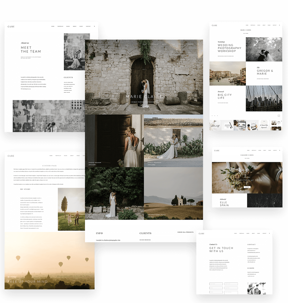
Cube is a visually refined, bold and ambitious website theme. Designed for photographers, videographers, bloggers or journalists seeking for a content driven design to showcase their portfolio online. While Cube offers a clean and polished look for its users, it is fully packed with features and layout options to choose from and build the perfect, modern website. We created it, keeping in mind both – landscape and portrait imagery, as well as any type of video content. Every single element and font choice was well thought out, and designed to maximize your chances of reaching more users and making them fall in love with your work and brand identity.
View Demo
Curious? Read more below to learn all you need to know about this beautifully crafted theme.
Navigation
Cube includes 7 distinct options for your menu and logo placement, to help you find that perfect look for your site. Choose a burger menu or full display of your menu items, with the right, left and centered alternatives for your logo. As always, we paid special attention to movement and smooth transitions on the theme, in order to create a seamless and enjoyable experience while navigating throughout your website. Turn on the sticky menu option and enjoy the smoothest fading transition when scrolling down your site.
Slideshows
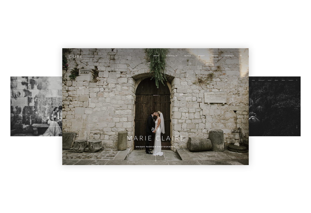
Cube includes a large, full-screen slider on its homepage, which supports images, video embeds and self hosted videos. You can add text on top of your slider, play around with its color and font sizes, add links, transition elements, slide effects and have it on autoplay. Apart from the main header slider, Cube also includes 3 additional slideshows for your Single Gallery views (more below).
Portfolio
Cube gives you 4 view types for your Portfolio, you can choose one, or even have multiple pages with different views:
List – displays your featured image and large text under it, with the gallery title, category, and short text snippet.
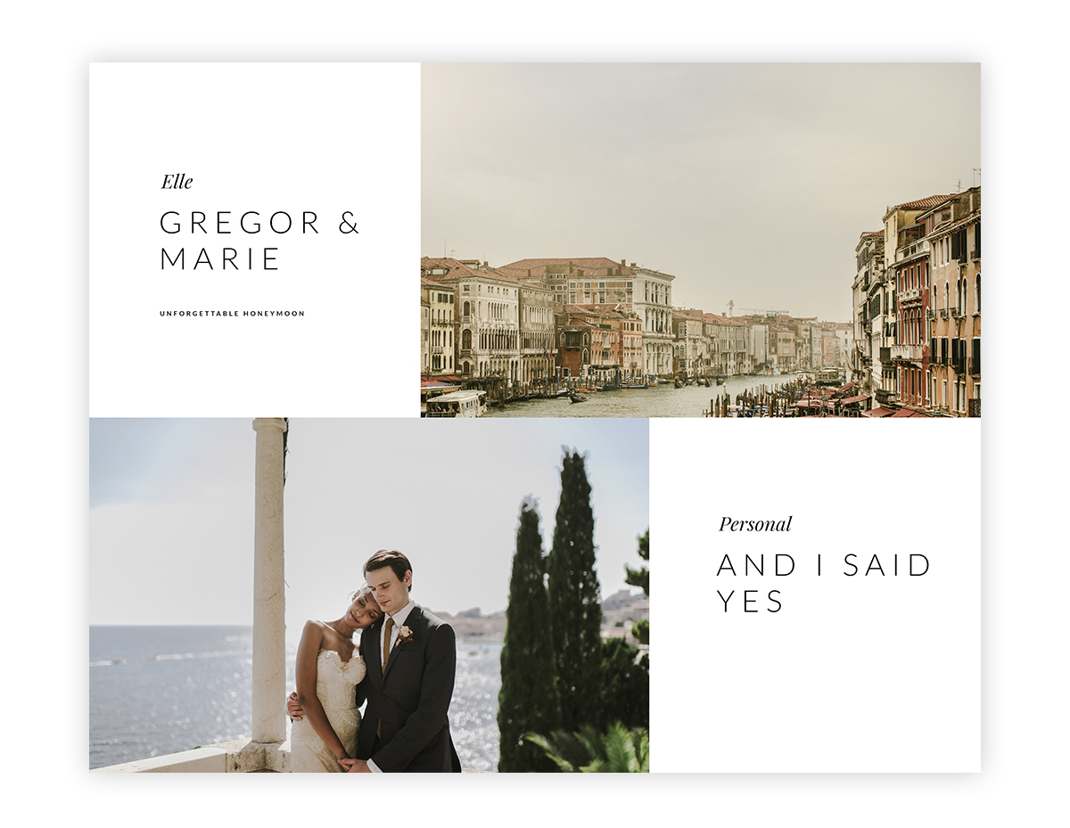
Card – an elegant showcase. This view will have your image and text alternating left or right. The clean, large typography, titles and categories are still beautifully displayed with this listing type.
Grid 2 – displays your featured images in a side by side large grid, with a light hover effect on each image block
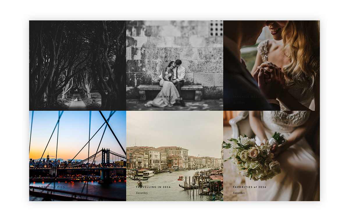
Grid 3 – displays your featured images in a 3 column grid. On hover, the title and category of each gallery is displayed in a small white square that appears in the bottom left corner of each image block.
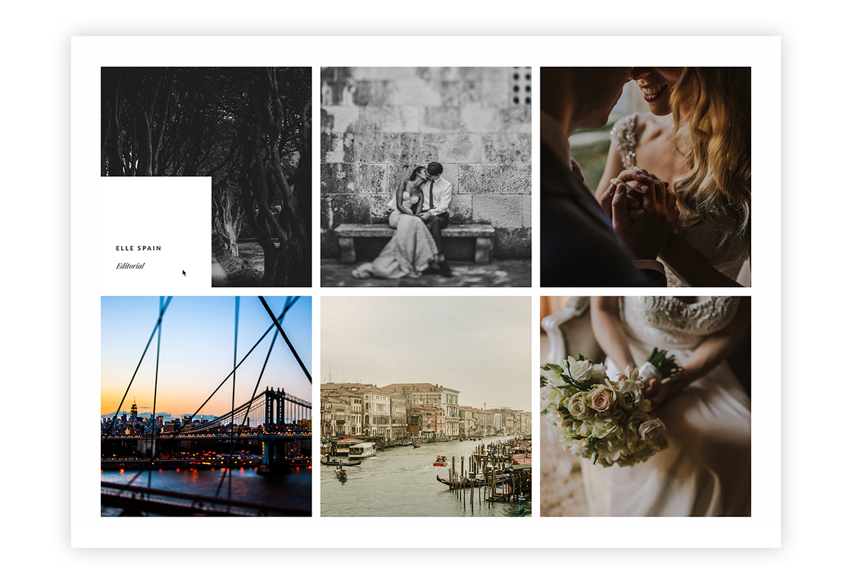
Single Gallery
Choose from 1 of 4 slider types for your single gallery. Each gallery can have its own view type to fit your needs and perfectly supports images and video embeds.
Grid – a classic or masonry grid, with up to 6 columns, and the option of cropping your thumbnails to any size, or keeping them in original image size.
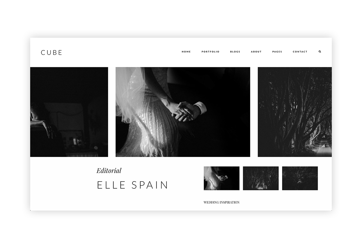
Classic Slideshow – a side by side type of slideshow, with the main image center aligned. You can move images from left to right and vice versa. The slider is non-crop, which makes it perfect for displaying your galleries.
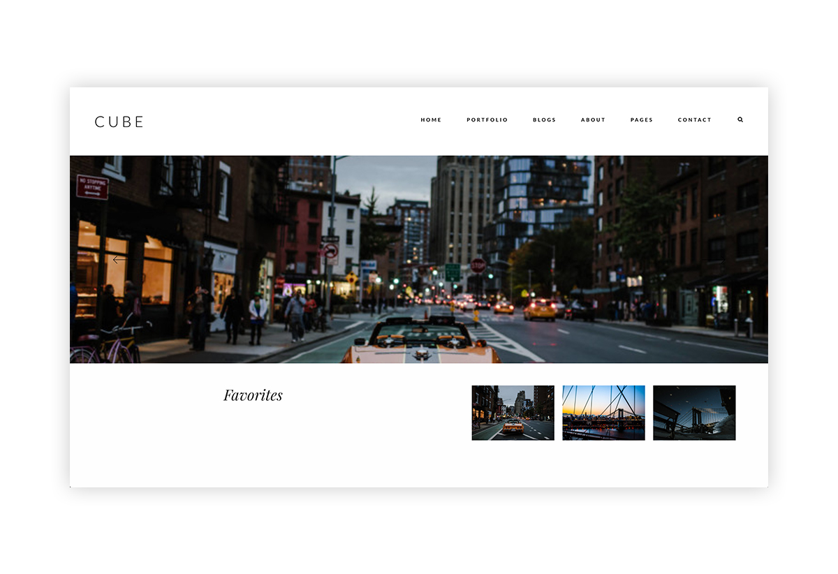
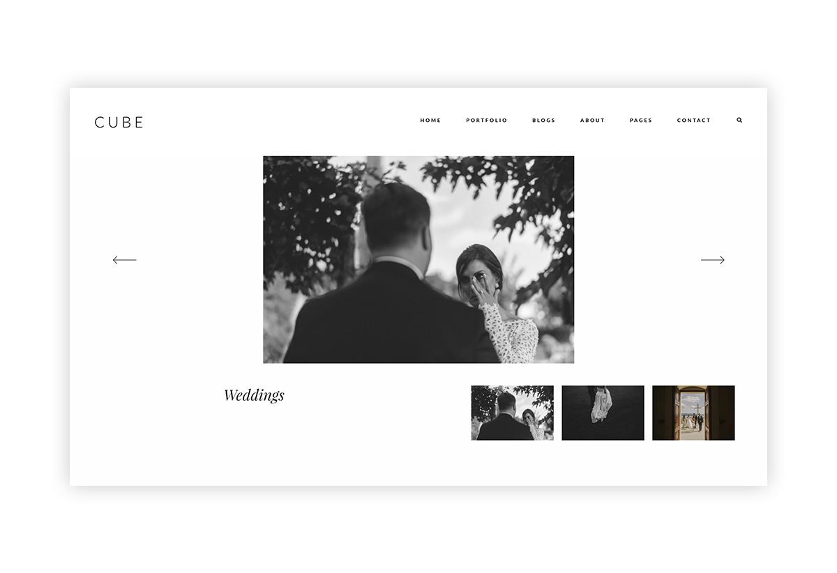
1-by-1 no crop slider – this slider displays each of your images one at a time, with the title, category and short gallery description showcased under the slider, along with small thumbs for current and next 2 photos.
1-by-1 crop slider – this slider displays each of your images one at a time, cropped and showcased at screen-width. Thetitle, category and short gallery description showcased under the slider, along with small thumbs for current and next 2 photos. The slider includes size crop flexibility.
Blog
Pick from 1 of 4 unique views for your blog listing page. Set up multiple pages if you want to create something fresh for different types of photography:
List – displays your featured image and large text under it, with the post title, category, and short text snippet.
Card – an elegant showcase. This view will have your featured image and text alternating left or right. The clean, large typography, titles and categories are still beautifully displayed with this listing type.
Grid 2 – displays your featured images in a side by side large grid, with a light hover effect on each image block
Grid 3 – displays your featured images in a 3 column grid. On hover, the title and category of each blog post is displayed in a small white square that appears in the bottom left corner of each image block.
Single Blog
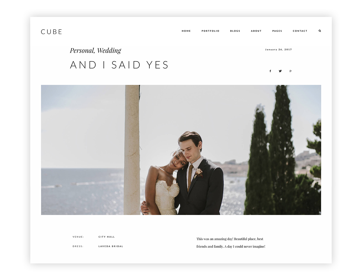
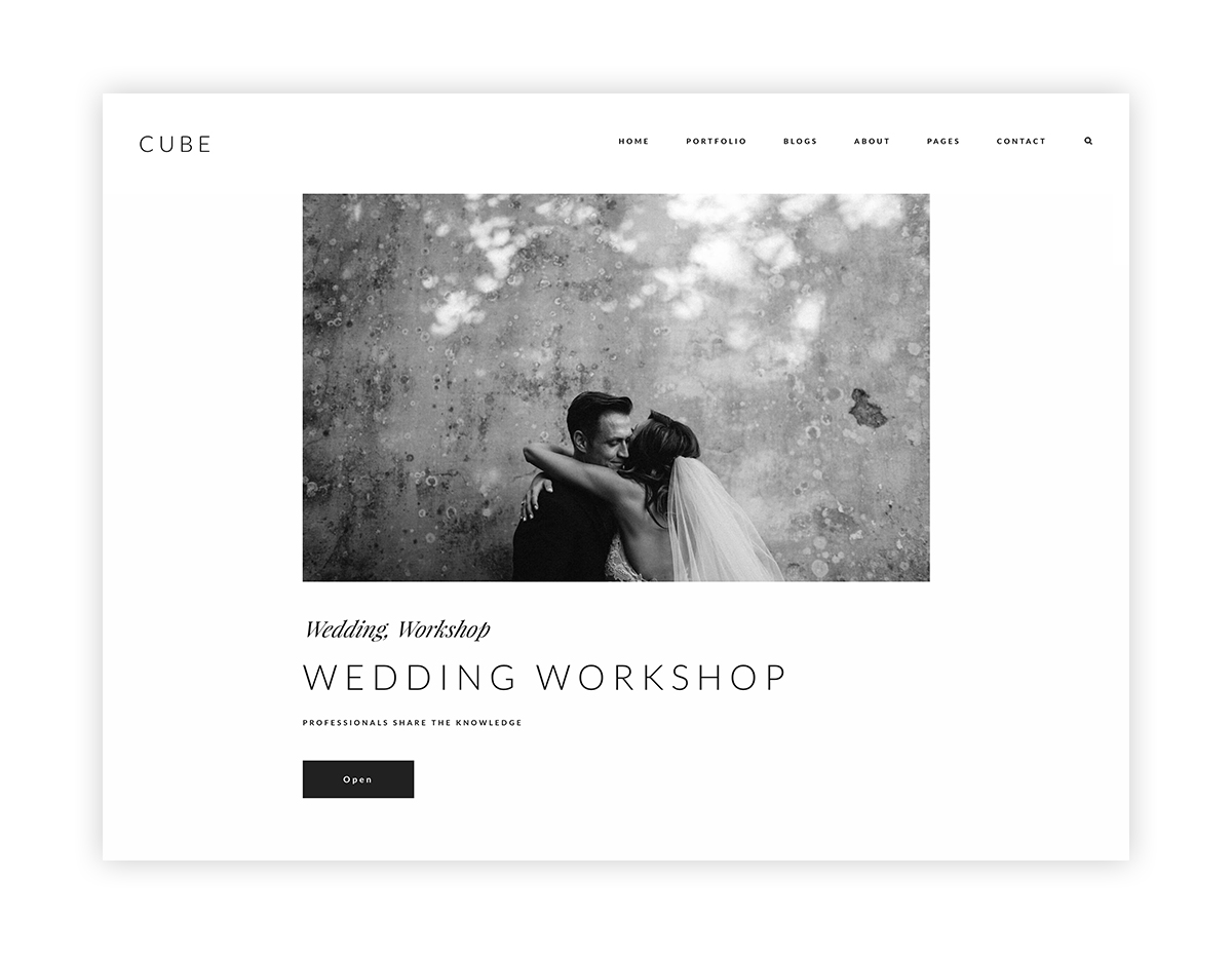
There are 4 view options for showcasing your single blog posts. You can opt for a large featured image/video on top of each post, and choose to have an article with or without a sidebar on the left, as well as center or right alignment for your images.
About, Press & Contact Pages
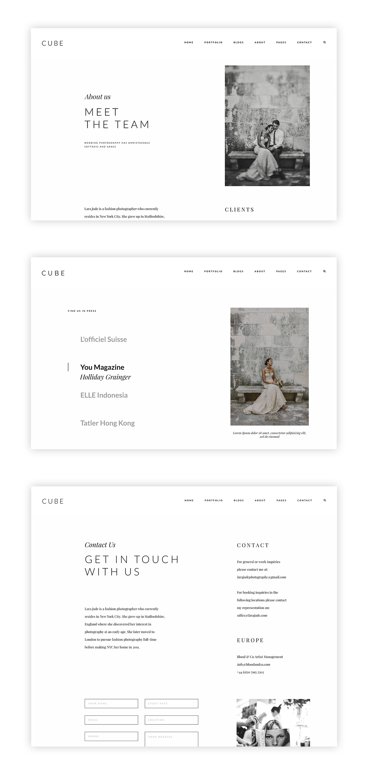
Cube comes with a range of layout options for each of your pages, to help you display your About, Press and Contact information in a beautiful and personalized way.
All our Contact page templates come with a built-in contact form which will help you collect information and easily get in touch with your potential clients. If you are interested in creating a personalized form we recommend using our Flo Forms plugin, as it’s a simple drag and drop builder, which allows you to add as many fields as you wish, track submissions and even get reminders for unread emails. If you prefer Contact Form 7 or Ninja Forms, you can effortlessly add your contact form by simply adding the shortcode to the shortcode section in the contact form template.
Custom Pages
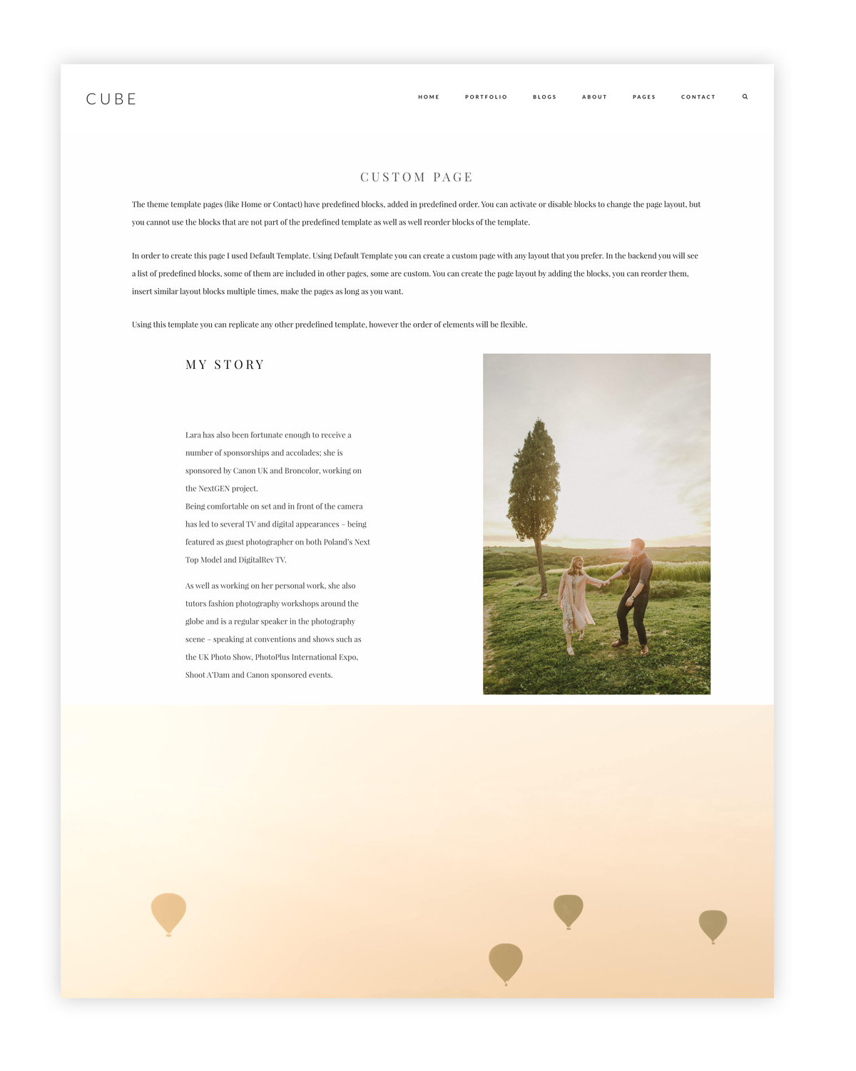
You will love this! It’s a quite new feature, that we’ve introduced at the end of December, along with our new Flo Backend. We’ve included a Page builder which you can use on your Custom Page templates, to build out new layout structures. You can add/remove or reorder blocks to get a fresh and unique design for any page. The builder is easy to use, and you will never feel lost or have too look for answers, since all the documentation, tutorials and hints are incorporated into the backend. For example, the Favorites page that you can see on Cube’s demo under Portfolio is build using a Custom page template. You can easily create something similar to display your favorite posts or galleries, have a clean separation within your Portfolio categories, or any other idea that you have in mind. The Custom Page builder allows you to build from scratch any type of page layout with all the blocks and features available within Cube.
Fonts
We are still excited about the two new awesome features related to your typography, that we’ve introduced with our previous themes – Rosemary and Monte:
1. You can create your own font styles or use predefined ones and easily apply them to any section you want. Forget about tons of time spent on searching for font sizes and names you used on certain pages and want to reuse. It’s all in your font styles.
2. You can use the Quick Font Setup option if you want to quickly apply your favorite fonts to the whole theme while maintaining all the sizes and proportions predefined by our designs.
As always, over 150+ free font options are accessible with Cube. All fonts can be modified to reflect your branding and style. If needed, there is also the possibility of uploading any additional fonts in .otf, .ttf, and .woff. Thus, the font combination possibilities are almost endless!
New Backend Experience & Documentation Integration
Our latest themes (Cube, Rosemary and Monte) have a truly immersive backend experience. We understand that it’s not always easy to make changes to your theme, and it takes time to understand all the nuts and bolts that come with it. For that reason, we’ve fully integrated the documentation into your theme, so you don’t have to navigate away from your site when learning more about using it. Each section is separated with a simple point system. Just read the intro before each section, and you’re good to go. Even better, we’ve added video tutorials to explain everything. We are confident that this will considerably simplify your process and make it more enjoyable and easy.
We’ve also spent some time updating the backend styling. Now, your theme looks great not only on the outside, but also on the inside. At Flothemes we’re always trying to improve your user experience along with your websites aesthetics. With the updates in our latest themes, we’ve created our best experience so far.
Now, let all of your stunning and remarkable work come together in one perfect website, with Cube! And since it’s Valentine’s week, we’re offering 25% off all our themes, including Cube! Use the code LOVEIS. And one more great news is that we have a second lighter style kit in works for Cube. Expect it soon with updates!
We can’t wait to hear more about your impressions and experience with this gorgeous theme and our new backend! All Photography credits go to the amazing and incredibly talented Marko Marinkovic!

