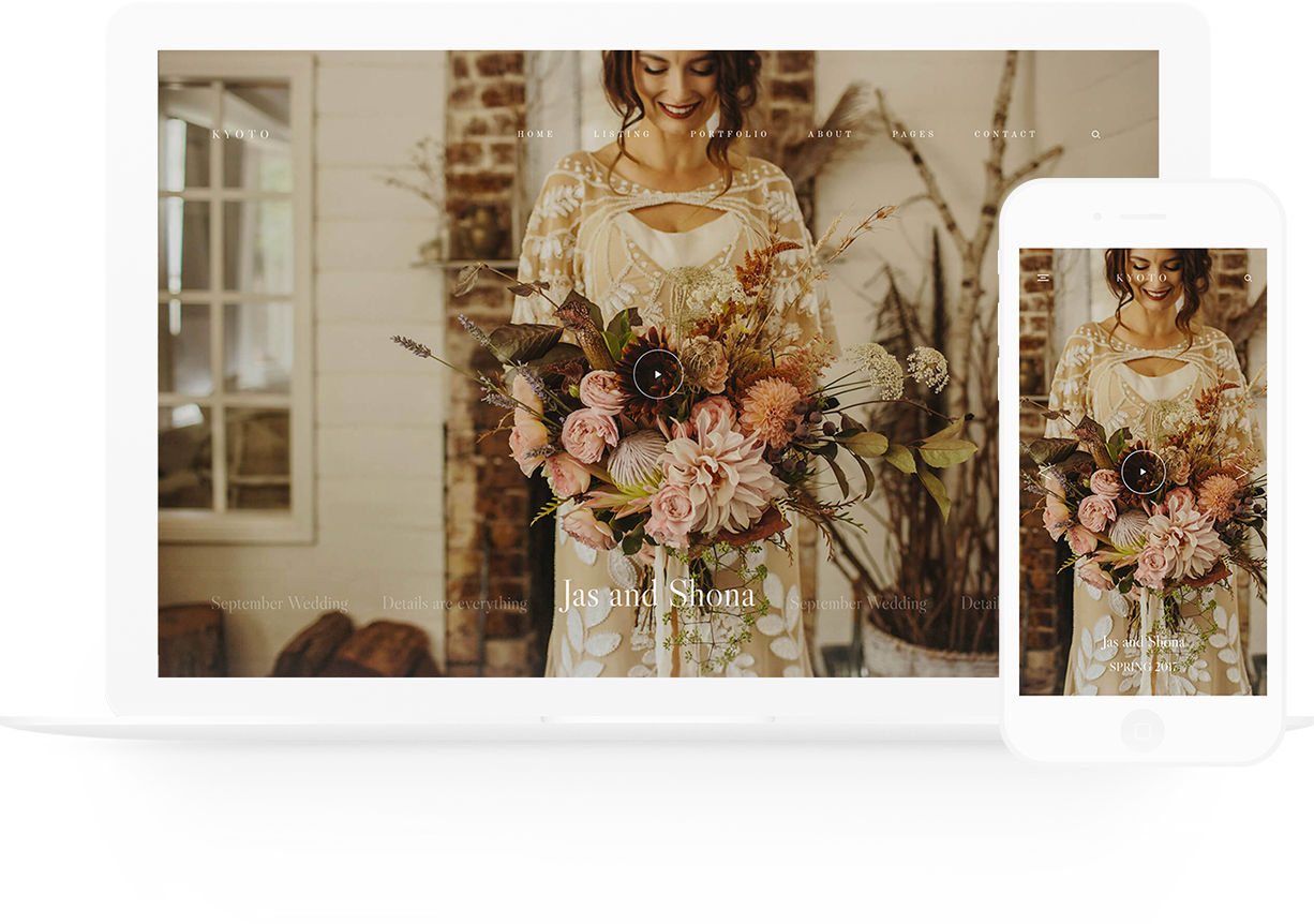
Let’s get one thing straight – this theme is EPIC!
With Kyoto, we’ve added flexibility and a customization freedom that allows the user to showcase their work like never before. This elegant theme masterfully veils a large range of layout possibilities and design elements that can be tailored to your unique needs.
VIEW KYOTO DEMO
Everything you see (or don’t see) can be tweaked. You are in full control of what you show on each page. Now you can hide page sections from the mobile version, but show them on the desktop version (big plus!). Kyoto will not only get you head over heels with its chic, avant-garde vibe, but it will seamlessly blend in with your branding and portfolio, highlighting your artistic taste and charming personality. We’ve crafted this image driven theme in a way that it easily adapts and compliments not only wedding photography work, but also travel, lifestyle, boudoir, fashion, fine-art and of course videography portfolios. Keep reading as the goodies are not only on the outside, but on the inside too (our backend just keeps getting better, we can’t stop!).
- Backend Goodies
- Instagram Layouts
- Footer Flexibility
- Navigation
- Quick Links
- Slideshow
- Portfolio & Blog Listings
- Custom Pages
- Video Gallery Options
- Single Galleries
- Single Blog Post
- Shop
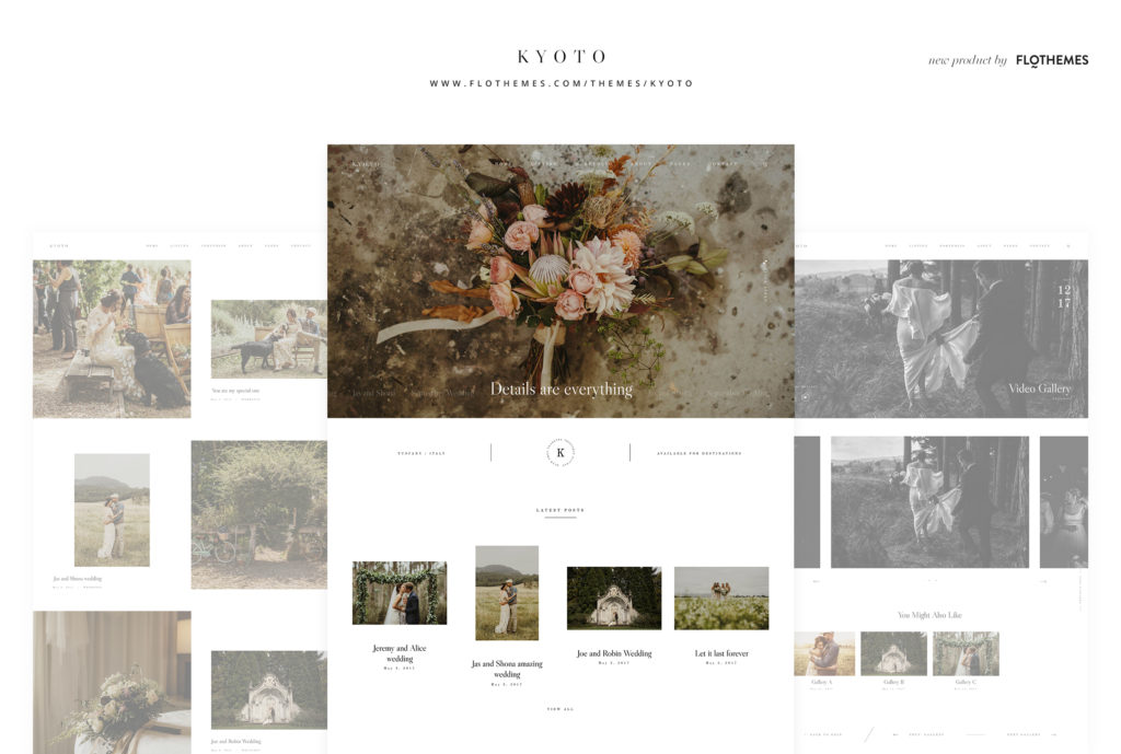
Backend Goodies
Before we dive into showing you all the perks and layouts of this new stunning theme, we have to tell you how awesome our backend got! We’ve improved your user experience, by offering a more interactive and beautiful (yes, beautiful) way of choosing page templates, customizing blocks and building something very unique. Your mobile site got more flexible and customizable as well. Play around with padding options for desktop and mobile, hide or show certain page blocks and be sure that your site users will have their best experience while viewing your work. Best seen than heard, right? Here’s a video perfectly describing how the interface looks and works now.
Navigation
Kyoto includes 4 header variations for your logo and menu items placement. Enjoy the classic menu look, or opt for a fresh, large typography layout with the menu items placed in the center of your slider.
Slideshow
We’ve included 3 types of sliders with Kyoto, with 6 layout variations, which can be added to any of your pages. Enjoy the stunning and interactive navigation running on the right side of your slider or at the bottom of it, when slides change. Or opt for a bold, polished look with the centered large menu items. And of course, the full screen slider as well as a beautiful framed one are available for you to experiment with.
Quick Links
Have some important info, workshop announcement or travel dates to share? Add them to your Quick Links section, available directly on your homepage slider. Use this section as a charming “welcome message”, share your manifesto or showcase of your most favorite galleries, latest publications or interviews. Here are a few examples of how to use the Quick Links section, and customize its layout, colors and structure:
Portfolio & Blog Listings
Kyoto offers 9 beautiful layouts for your Portfolio & Blog listing. You can choose one, or have multiple pages with different views. It’s up to your creative vision!
50/50 alternating – this view will have your featured image and text alternating left or right, with beautiful, large typography. All images are kept in their original proportions. You can easily combine verticals and horizontals in a playful, minimalistic layout.
Double image showcase – have 2 favorite photos from the same gallery or article, and can’t decide which one should go as the featured image? No problem, show both with this gorgeous listing layout.
Classic Grid – displays your featured images in a 2-4 column grid, with gallery titles placed under each image. Choose the masonry or cropped option.
Classic List (non-crop) – your featured images are showcased in a classic list view, with large text under. All images are displayed in their original size.
Large Grid – displays your featured images in a large, wide-screen column grid.
Grid (no-crop) – displays your featured images in a 3 column grid, with the titles under the images. Combine verticals and horizontals for a playful, minimalistic layout.
Latest highlights – emphasize your most recent galleries and shoots! This view will highlight your latest 3 posts, and show the rest of them in a 3 column grid, with the titles under the images.
50/50 view – similar to the 50/50 alternating view, only with your images (verticals & horizontals) placed on the left side strictly, while your title and category displayed on their right side. Again, with great negative space to let your page breath, and users focus solely on your content. If you prefer a more structured feel to your portfolio or blog listing, with less negative space between images and all aligned, go with 50/50 column view B.
Single Gallery
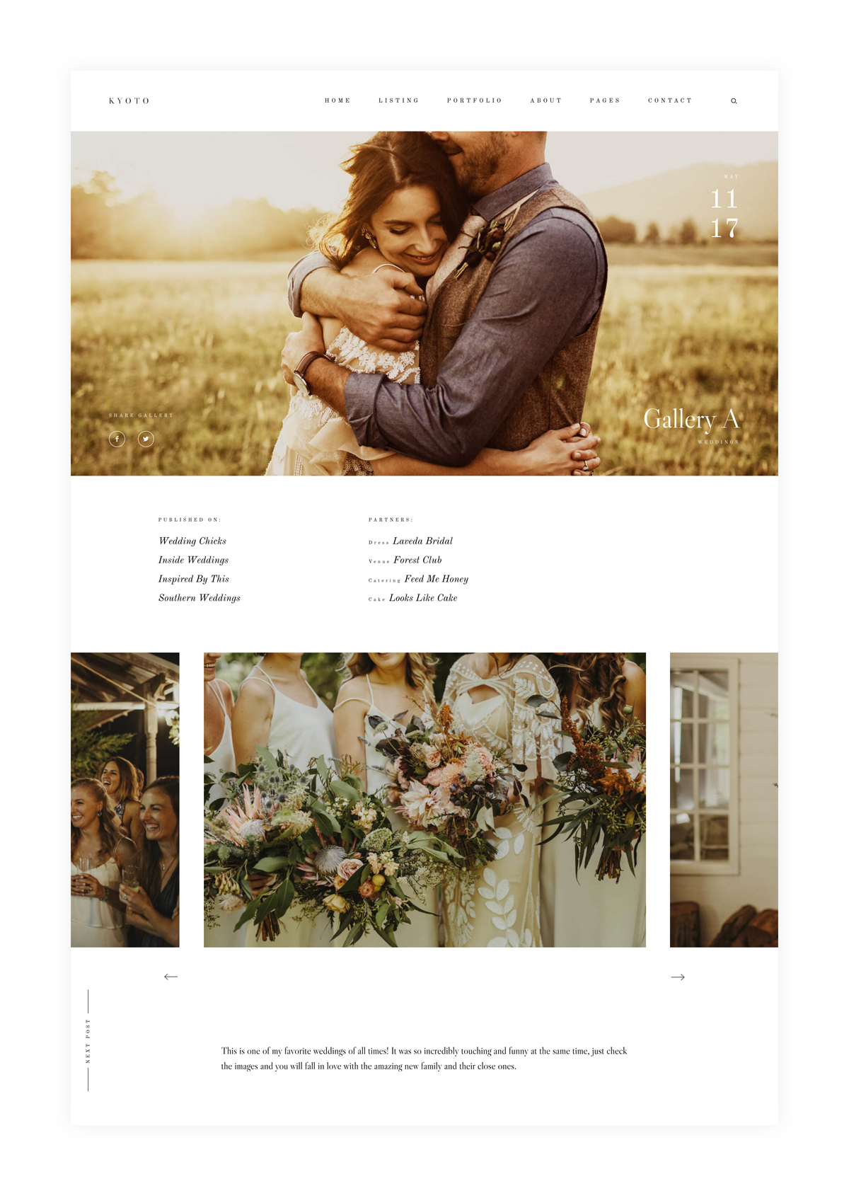
Kyoto offers 3 stunning layouts to exhibit your single galleries in a unique and beautiful way, adapting to the style and feel of the photos. We know how important it is to give credits to second shooters and vendors – so we’ve included some listing options for partners too. Enjoy:
Slideshow – a side by side type of slideshow, with the main image center aligned. You can move images from left to right and vice versa. List all the partners, vendors and publications above the slider, as well as a text description about the gallery under the slider. And of course, you want to make sure that your site visitors explore more than one photo gallery, therefore – have a list of recommended or “you may also like” links to other galleries at the bottom of your page.
Creative Grid – love negative space, and want a more creative way to show your gallery? choose this airy 2 column grid, which displays all your images in their original size, and allows your viewer to dive into each image at his/her own pace, without being tempted by the following 3-4 photos. Try this layout if you also shoot boudoir, as it will add an intimate, delicate feel to your gallery.
Masonry Grid – a classic masonry grid, which smoothly loads all your gallery as the user scrolls down the page. Includes an optional full screen featured image on top of your gallery. Be sure to appreciate the beautiful typography, social shares, as well as the option to include the partners and vendors that you’ve worked.
Single Blog Posts
If you haven’t already, time to get excited! With Kyoto you have Gallery Grid options inside your blog posts. You can easily create them with the gallery shortcode and jetpack plugin. You have several beautiful examples listed on our demo – Square Tiles, Tiled Columns and Tiled Mosaic.
The classical post options are always available for you to use as well, along with the Partners Listing options in there.
Video Options & Video Galleries
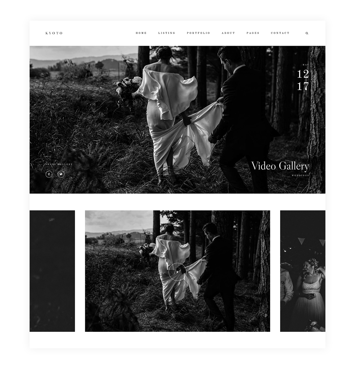
We always keep in mind our videographer and filmmaker friends. Use any of the 3 stunning single gallery layouts to display your video work. All you need to do is add a video embed from youtube or vimeo. You can those to any page or blog post. Also you can include self hosted videos in a loop on your home slider.
Here are the video gallery layout options:
Slideshow – a side by side type of slideshow, with the main featured image of your videos center aligned. You can move from left to right and vice versa.
Creative Grid – love negative space, and want a more creative way to show your video gallery? choose this airy 2 column grid, which displays all your featured images for the videos in their original size. Click on any of the images, and your videos appear in a pop-up slideshow.
Masonry Grid – a classic masonry grid, which smoothly loads all your video gallery as the user scrolls down the page. Click on any of the images, and your videos appear in a pop-up slideshow.
Custom Pages
Great news! Now, all your pre-defined page templates can be customized and tweaked. You can choose to build a page from scratch, or use any of the templates that we’ve masterfully crafted for you. However, even the templates are very flexible now to play around with and tweak. Take some time and experiment with the pages and blocks to create something unique and personalized to your own style, branding and character. Some examples of custom built page layouts are the Speaking, Info and Investment Pages. While the About, Contact and all Home pages have been build using the predefined templates.
A quick reminder, if you want to take your pricelists and investment page to a completely different level, check out our Flo HUB plugin. It’s a drag and drop builder which allows you to easily build beautiful and interactive pricelist pages, responsive across all devices and in line with your branding and Flothemes styling.
All our Contact page templates come with a built-in contact form which will help you collect information and easily get in touch with your potential clients. If you are interested in creating a personalized form we recommend using our Flo Forms plugin, as it’s a simple drag and drop builder, which allows you to add as many fields as you wish, track submissions and even get reminders for unread emails. If you prefer Contact Form 7 or Ninja Forms, you can effortlessly add your contact form by simply adding the shortcode to the shortcode section in the contact form template.
Footer Flexibility
Have you noticed how Kyoto’s homepage on the demo has no footer, keeping it extra clean and minimal, while most of the other pages include a stunning footer, showcasing your contact details, menu items, social buttons, as well as featuring your Instagram account? Well, now you choose which pages you want your footer displayed on, as well as what type of information you want to include in it. Forget about using widgets! Now, you have a builder in your footer. Add your most important links and call to actions – social media follow, newsletter signup, inquiries, etc. Here are a few examples of footers you can build with Kyoto.
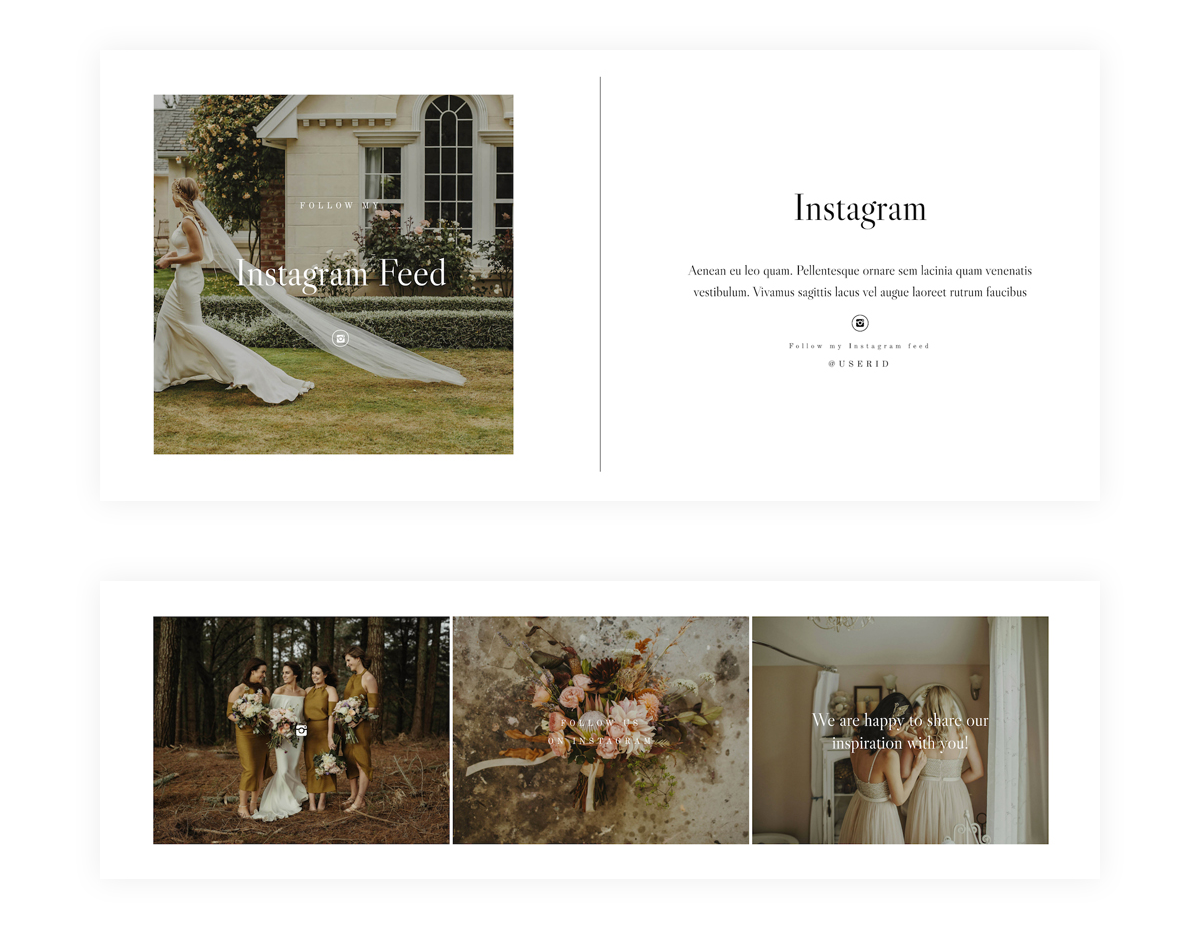
Instagram Layouts
To offer you more flexibility and possibilities to showcase your Instagram account on your website, we’ve added a few new layout options. You can use our FloInstagram plugin and have your live Instagram feed displayed in a line at the bottom of your pages, or upload 1-3 photos of your choice, experiment with your Call to Action – to know what gets more website visitors connect with you on Instagram. See all new layouts here.
Shop
Using WooCommerce on your site for a shop? Kyoto will automatically apply basic styling to your woocommerce shop, so it looks aligned to your branding and website design. See an example here.
GET KYOTO
Time to start creating something beautiful, fresh and unique for yourself and your brand! Save 15% on your purchase with the code: MAY15. Want a little extra OFF? Share this article on Facebook with the tagline “@Flothemes, I want Kyoto” or tag us with the same message in your Instagram Stories, and we’ll send you a code. Also, if you’re switching between themes, here’s a video tutorial with a Step By Step Guide.
We can’t wait to hear more about your impressions and experience with this bold, elegant new design! All Photography credits go to the amazing Danelle Bohane!
Flothemes,
Improve your look, improve your price.

